Color Fundamentals
Learn about color fundamentals in Supa Colors Studio.
OKLCH Color Model
Supa Colors Studio uses OKLCH (OK Lightness Chroma Hue) as its primary color model. OKLCH is the most modern and scientifically accurate model available. All generation algorithms work natively in OKLCH for maximum precision.
Advantages of OKLCH:
- Uniform perception: equal changes in values correspond to visually equal changes
- Wide gamut support: correctly handles P3 colors
- Intuitive manipulation: lightness, chroma, and hue are independent and easy to understand
- Precision: maintains color precision through conversions and transformations
OKLCH represents colors with three components:
- L (Lightness): 0-100%, the perceived brightness
- C (Chroma): 0-0.4+, the color saturation/intensity
- H (Hue): 0-360°, the color hue (red, green, blue, etc.)
Color Gamut
The gamut (color range) defines the color space available for palette generation. Different devices support different gamuts.
- sRGB: The traditional standard for web and displays. Supported by all devices. More limited in terms of vibrant colors available. Use this if you need to ensure universal compatibility.
- P3 (Display P3): Wider gamut supported by many modern displays (Mac, iPhone, iPad, some monitors). Offers more vibrant and saturated colors than sRGB. Recommended for modern projects that can leverage wide gamut displays.
You can switch between sRGB and P3 gamuts using the gamut toggle in the Settings Bar (the central floating bar at the top of the editor). The toggle is located in the right section of the Settings Bar, next to the color format selector.
Color Formats
You can export and display colors in different formats. The display format does not affect generation, which always happens in OKLCH.
- HEX: Standard hexadecimal format (#RRGGBB or #RRGGBBAA). The most common format for web and design tools. Easy to copy and use.
- RGB: Red, Green, Blue with 0-255 values. Useful for CSS (rgb()) and some frameworks. Includes support for alpha channel (rgba()).
- HSL: Hue, Saturation, Lightness. Familiar to many designers, but less precise than OKLCH. Useful for compatibility with existing code.
- OKLCH: The native format of Supa Colors Studio. The most precise and modern. Recommended for new projects. Supported by modern browsers (oklch() in CSS).
Contrast Algorithms
Supa Colors Studio uses two scientific algorithms to calculate contrast between colors and verify accessibility compliance.
- WCAG (Web Content Accessibility Guidelines): International standard for web accessibility. Uses contrast ratio (e.g., 4.5:1) based on relative luminance. Official levels: AA (4.5:1 minimum for normal text) and AAA (7:1 for enhanced accessibility). These are official W3C standards.
- APCA (Advanced Perceptual Contrast Algorithm): Modern algorithm based on human perception. Uses Lc units (lightness contrast). More accurate for modern displays and different font sizes. In Supa Colors Studio, we use custom thresholds: A (60 Lc minimum), AA (75 Lc enhanced), AAA (90 Lc maximum). Note: These are custom thresholds, not official APCA standards. APCA is being considered for WCAG 3.0.
Understanding contrast badges and limits:
- Badge Colors: Green (passes AA or AAA), Amber (passes A but not AA), Red (fails all thresholds).
- Icons: Double check (AAA - highest compliance), Single check (AA - standard compliance or A - minimum), X (FAIL - below minimum).
- WCAG Limits: Normal text: AA = 4.5:1, AAA = 7:1. Large text: AA = 3:1, AAA = 4.5:1. These are official standards.
- APCA Limits: Normal text: A = 60 Lc, AA = 75 Lc, AAA = 90 Lc. Large text: A = 45 Lc, AA = 60 Lc, AAA = 75 Lc. Graphics: A = 30 Lc, AA = 45 Lc, AAA = 60 Lc. These are custom thresholds used in Supa Colors Studio.
Contrast information is shown throughout the editor:
- Contrast badge on each shade with color and icon indicating compliance level
- Exact contrast value (e.g., "4.5:1" or "60 Lc") visible in the badge
- Tooltip with additional details
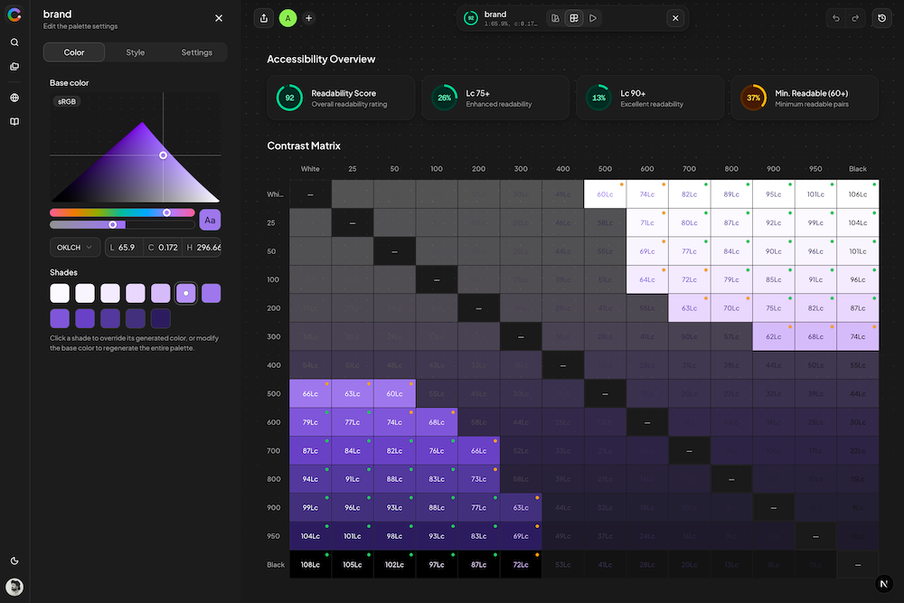
- Contrast View: dedicated view showing contrast matrix and statistics
- Contrast Matrix: grid visualizing all color combinations with pass/fail indicators
- Contrast Statistics Cards: overview cards showing pass/fail counts for different contrast levels
The Contrast View provides a comprehensive analysis of your palette's accessibility. It displays a matrix showing contrast ratios between all color combinations, making it easy to identify which pairs meet accessibility standards.
Foreground Source:
The Foreground Source setting controls which colors are used as foreground (text) when calculating contrast for each shade in your palette.
- Palette Colors (default): For each palette, automatically finds the shade with the highest OKLCH lightness (lightest) and the shade with the lowest OKLCH lightness (darkest), and uses them as the two foreground colors. These are dynamic values — they change whenever your palette colors change. Each shade is tested against both foreground colors and the best contrast is used.
- Black & White: Uses pure black (#000000) and pure white (#FFFFFF) as foreground colors. Every shade will have good contrast with at least one of these, so scores tend to be higher. Use this mode to check how your colors work with standard black/white text.
CVD Simulation
CVD (Color Vision Deficiency) Simulation allows you to see how your palettes appear to people with different types of color blindness. This is essential for creating accessible designs.
Supa Colors Studio simulates 10 different vision modes organized in 4 groups:
Normal Vision:
- Normal: Standard vision without filters. Default mode for viewing colors as intended.
Red-Green deficiencies (most common, affecting ~8% of men):
- Protanomaly: Reduced sensitivity to red. Mild form where reds appear darker and less saturated.
- Protanopia: Complete inability to see red. Reds appear very dark, difficult to distinguish from green.
- Deuteranomaly: Reduced sensitivity to green. Most common form of color blindness. Difficulty distinguishing red and green.
- Deuteranopia: Complete inability to see green. Similar to protanopia, reds and greens are confused.
Blue-Yellow deficiencies (less common):
- Tritanomaly: Reduced sensitivity to blue. Mild form with difficulty distinguishing blue from yellow and purple from green.
- Tritanopia: Complete inability to see blue. Blues appear green, yellows appear light pink or gray.
Monochromacy (very rare):
- Achromatomaly: Partial absence of color vision. Colors are very desaturated, almost grayscale.
- Achromatopsia: Complete absence of color vision. See only in grayscale. Extremely rare.
Use CVD simulation to:
- Verify that colors are distinguishable for everyone
- Avoid using only color to communicate information
- Ensure palettes work for all users
- Test color combinations before publishing